Instagram Stories fonts… one of those things you don’t really think about. You just pick one, throw it on top of your image and Bob’s your uncle. What if I told you, with a little bit of know-how and insight, you can align the fonts you’re using and how you’re using them with your brand personality, so that how you’re showing up is consistent and aesthetically pleasing!?
Welcome to a brand new era for Hopscotch Branding Studio! Introducing… The Weekly Takeaway! ☕️ Tips, advice, design tricks and branding chit chats from me to you… in a bite size format. Easy to digest, actionable branding and design related content that you can absorb over your morning coffee (or evening tea!).
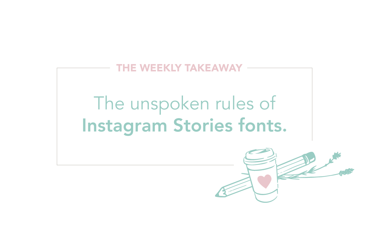
The very first edition outlines the dos and don’ts of Instagram Stories fonts when it comes to communicating your brand personality. Watch this tutorial to learn which fonts are right for your brand, how to use colour and which fonts you shouldn’t touch with a ten foot pole!
Subscribe below to receive these actionable tips directly to your inbox!
Rach x
What great information – love the advice on the colour wheel I never knew how to find it. Thanks