CLIENT: MUMMYCON
PROJECT: BRANDING IDENTITY
- • Logo design
- • Illustrated branding elements
- • Imagery selection
- • Font recommendations
- • Comprehensive colour palette
- • Facebook cover
- • Business cards
- • Website banners
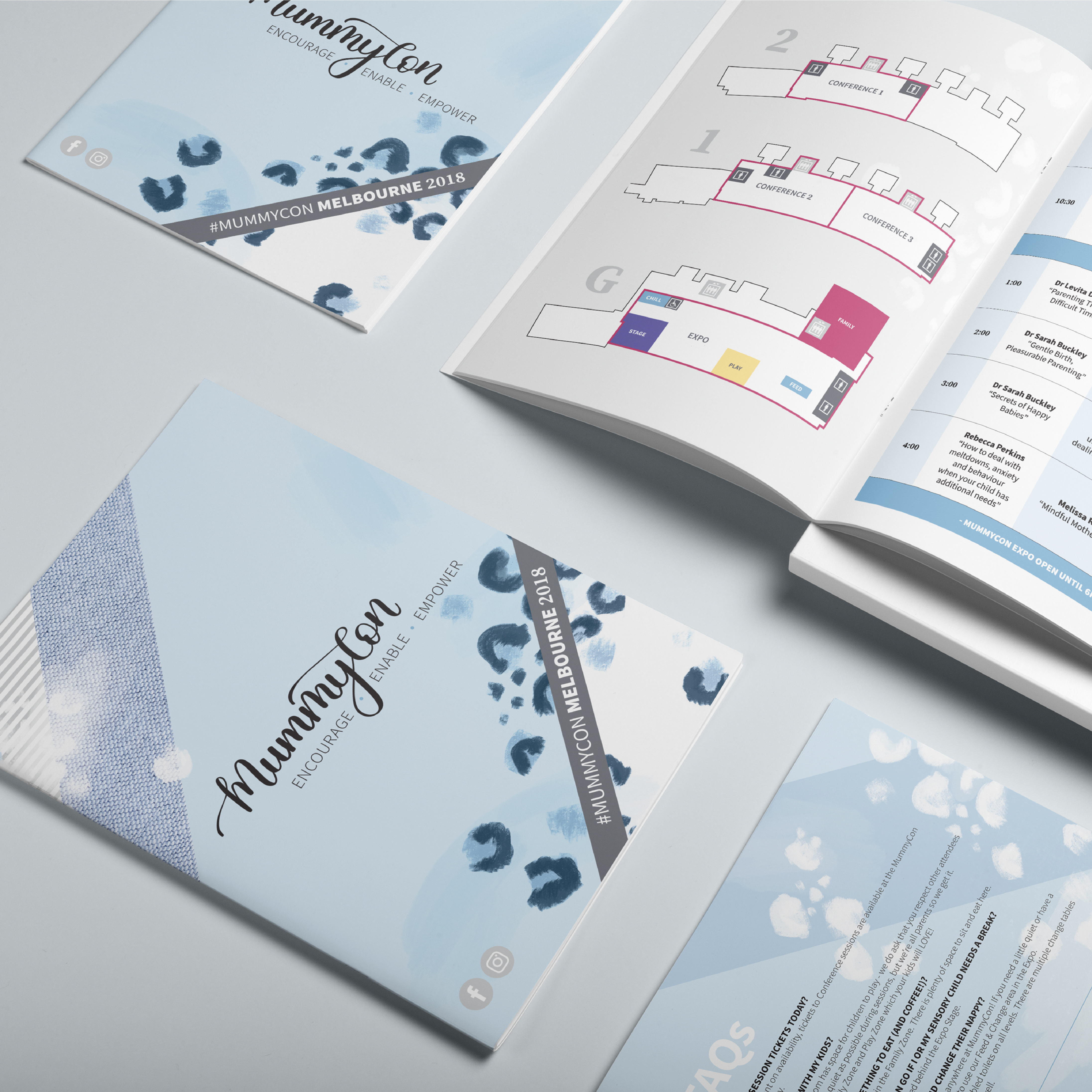
- • Event guide
- • Event signage
The colour palette selected for MummyCon is soft and nurturing, whilst including a splash of personality. The blush pink brings warmth and softness, while the green signifies growth, eco-friendly and 'earthy’. Combining these with soft blues which symbolise trust and reliability, provides a solid representation of the core values and service offerings of MummyCon.
The calm, muted tones of the imagery set the mood and tone of MummyCon's brand personality, appealing to a target audience of parents seeking solutions for calm, respectful parenting.
Custom illustrated branding patterns, inspired by leopard print, not only represent the strength and perseverance of parenthood, but also hold personal significance for co-founders, Mim and Dominique. These combined with the brush lettered logo and other earthy textures create the foundation of the MummyCon branding identity.


