
CLIENT:
ADELAIDE LADIES CONNECT
PROJECT: BRANDING IDENTITY
- • Logo design
- • Illustrated branding elements
- • Imagery selection
- • Font recommendations
- • Comprehensive colour palette
- • Facebook group and page covers
- • Illustrated icons
- • Social media templates
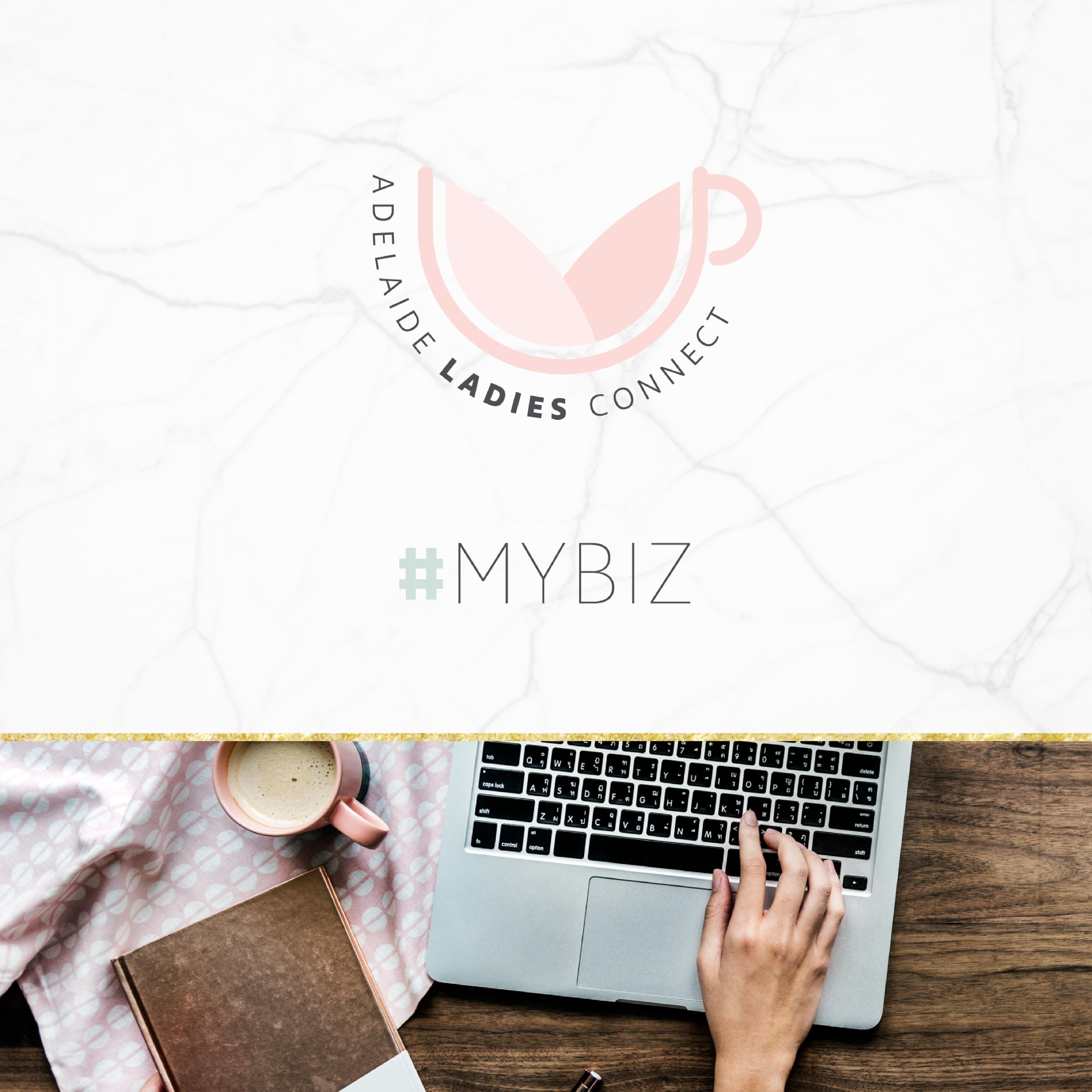
The Adelaide Ladies Connect branding identity is based on the keywords: connection, support, nurturing, welcoming and safe.
The look and feel of this feminine branding identity is intended to appeal to a 30-something Mum who runs a business from home. She’s looking for genuine connections, child-friendly networking opportunities and business growth.
The hand illustrated coffee, wine and child-friendly icons can be used for different events as watermarks or ‘stamps’ to identify the ALC brand and support the logo.
The ALC logo is based on the concept of a coffee cup, symbolising connection, conversation, interaction and warmth (and of course ALC’s iconic coffee catch-ups which started it all). The two leaf shapes connecting represent growth and nurturing, with a blossoming flower. The negative space created by these leaf shapes (an upside down triangle) is symbolic of the chalice, which is the ancient symbol for female.


