Colour psychology is based on the concept that colours have a neurological effect on our feelings and emotions. From a young age, we are conditioned to associate colours, tints and shades with various feelings, thus reacting in a relatively predictable way. Colour conveys moods that attach themselves to human feelings, emotions and reactions, whether we are conscious of it or not.
Every colour has meaning that we intuitively sense through learned association. For example, yellow is renowned as a happy, joyful colour. It is associated with the warmth of the sun, summer time, sunflowers and tropical fruits. Green conjures feelings of freshness, growth, organics and luscious coolness. Think about the cool grass under your bare feet, and spring buds bursting. Are you picking up what I’m putting down? If you haven’t considered colour psychology and how it affects your visual brand, it’s time we get those cogs turning.
Colour theory
Let’s start with the basics. Below are a few terms you may have heard thrown around by graphic designers. Sure, you’ve nodded and agreed but haven’t really understood what they actually refer to. Right?
- HUE: colour (e.g. red, yellow, green etc.)
- VALUE: the relative lightness or darkness of a colour
- SATURATION: the intensity or strength of a colour
- TINT: the lightness of a colour by adding white
- SHADE: the darkness of a colour by adding black
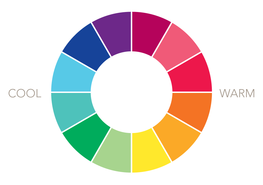
Temperatures
It’s important to note that half of the colour wheel is associated with coolness and calm, whereas the other half gives warmth and vitality.
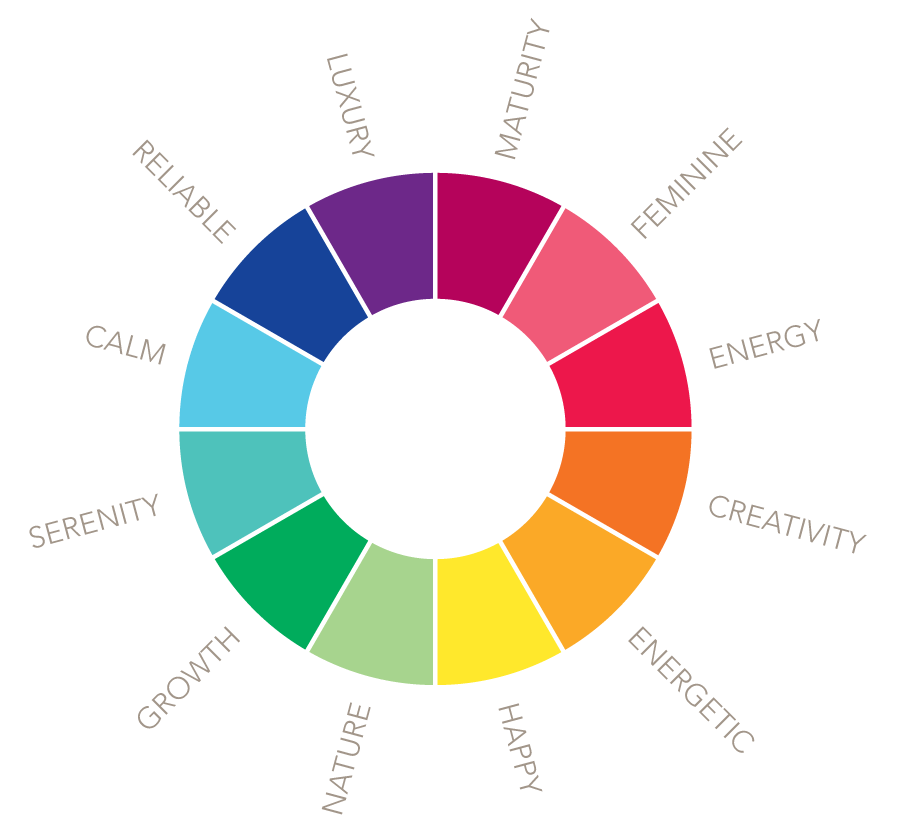
Colour associations
Various hues, tints and shades have different meanings associated with them. Although colour psychology is relatively unexplored, these can be used as a guide to create a colour palette that shoots cupid’s arrow into the heart of your ideal clients with an array of colour that encourages certain feelings and emotions in a caressing, harmonious way.
How does colour psychology affect your visual brand?
From my own experience, colour has such a profound effect on emotions and feelings, but can also be a useful tool to enhance recognition and memory. Check out these examples and think about the colour that you subconsciously associate with that particular brand.
In the same way, you can use colours and combinations of colours to create a unique colour palette for your visual brand. Through repetition and consistency, your brand colour palette has the potential to be strongly associated with your own brand.
How can colour enhance the message you’re sending?
Certain hues, tints and shades can attract or repel, depending on the perception of your audience. Always consider the feelings and emotions that your client avatar may be feeling, along with the message you’re trying to communicate before establishing your colour palette. How can you solve their barriers and pain points? Which colours are going to ease their concerns and evoke confidence in your offering?
Always start with your brand message first, then select your colour palette based on the emotions and feelings most commonly associated with those colours.
It’s also important to consider your audience’s individual perceptions. Think about spirituality, cultural differences etc. For example, in Western cultures white is symbolic of purity and love, whereas in some Asian countries, white is the colour of mourning and is commonly worn at funerals.
In summary, colour psychology is a useful and often overlooked tool in harnessing the power to encourage a certain emotional response in your audience. It can be used to create a memorable experience and if carefully considered, can positively affect your visual brand.
My top three tips for choosing a colour palette
- Make sure you have a solid understanding of your ideal client’s feelings, barriers and motivations before creating your brand colour palette.
- Consider how you would like your audience to feel when they see your colour palette.
- DO NOT choose your brand colours based on personal preference. What appeals to you and your personality, may not be what woos your ideal client.
Want to know more? Come and join my free Facebook group Branding Lifeline for Biz-Ladies and ask me all of your questions!
thank you for an interesting read.